Teamup
Redesigning the user journey to increase engagement and program enrollment.
Role
Timeline
Product Design
User Research
Prototyping & Testing
Mar 2024 - Ongoing
Tools
Project
A volunteer project to help redesign the website for a nonprofit with a team of marketing strategists and a senior UX designer.
[IN DEVELOPMENT]
Figma
Trello
Mural
Canva
1. Overview & Problem
“We have 3 weeks to redesign the website to increase user engagement and enrollment.”
Teamup is a Texas-based nonprofit that is on a mission to inspire and equip the next generation of software engineers.
As stated on their website, “There is a growing technology skills gap among college graduates in the United States. 67% of employers report that college graduates lack the technical skills needed for entry-level software engineering and programming positions (National Association of Colleges and Employers).”
Teamup is seeking to expand their media presence and user engagement. However, their current website flow is inconsistent and does not effectively represent the organization’s impact and mission.
Upon my brief introduction to a team of designers, marketing strategists, content writers, and web developers, we immediately got to work. While we each had different responsibilities, we were all given the same goals:
1. Increase student enrollment from 15 to 100 in 3 weeks
2. Over the next few months, redesign the website to increase overall user and media engagement.
How can we enhance the user journey to help visitors find their way?
1a. Sneak Peek
Teamup (a nonprofit created to inspire and equip the next generation of software engineers) gets a makeover!
Original Teamup Website
Prime pain points
1. Unclear navigation to participate in programs.
2. Information overload that could lead to confusion or distrust.
3. Inaccessible branding (i.e. logo) and media presence.
Applied solutions
1. Various CTA for navigation of program involvement for any user.
2. Restructure the design architecture to make information more digestible.
3. Redesign brand representation across website and media platforms.
Redesigning a tool for Central Valley communities to access affordable, mobile dental care.
2. Research & Empathy
A lack of information architecture and user flow.
Specific goals and key markers for this project were divided into 2 categories: short-term and long-term. Although the research conducted had the primary goal of improving the overall accessibility and design of the website, we prioritized changes that would allow us to meet our short-term goals first.
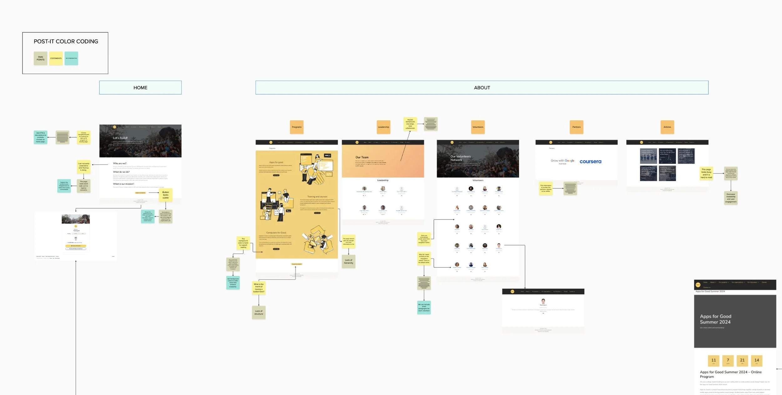
With our limited time, myself and a senior product designer performed usability tests on the previous website design.
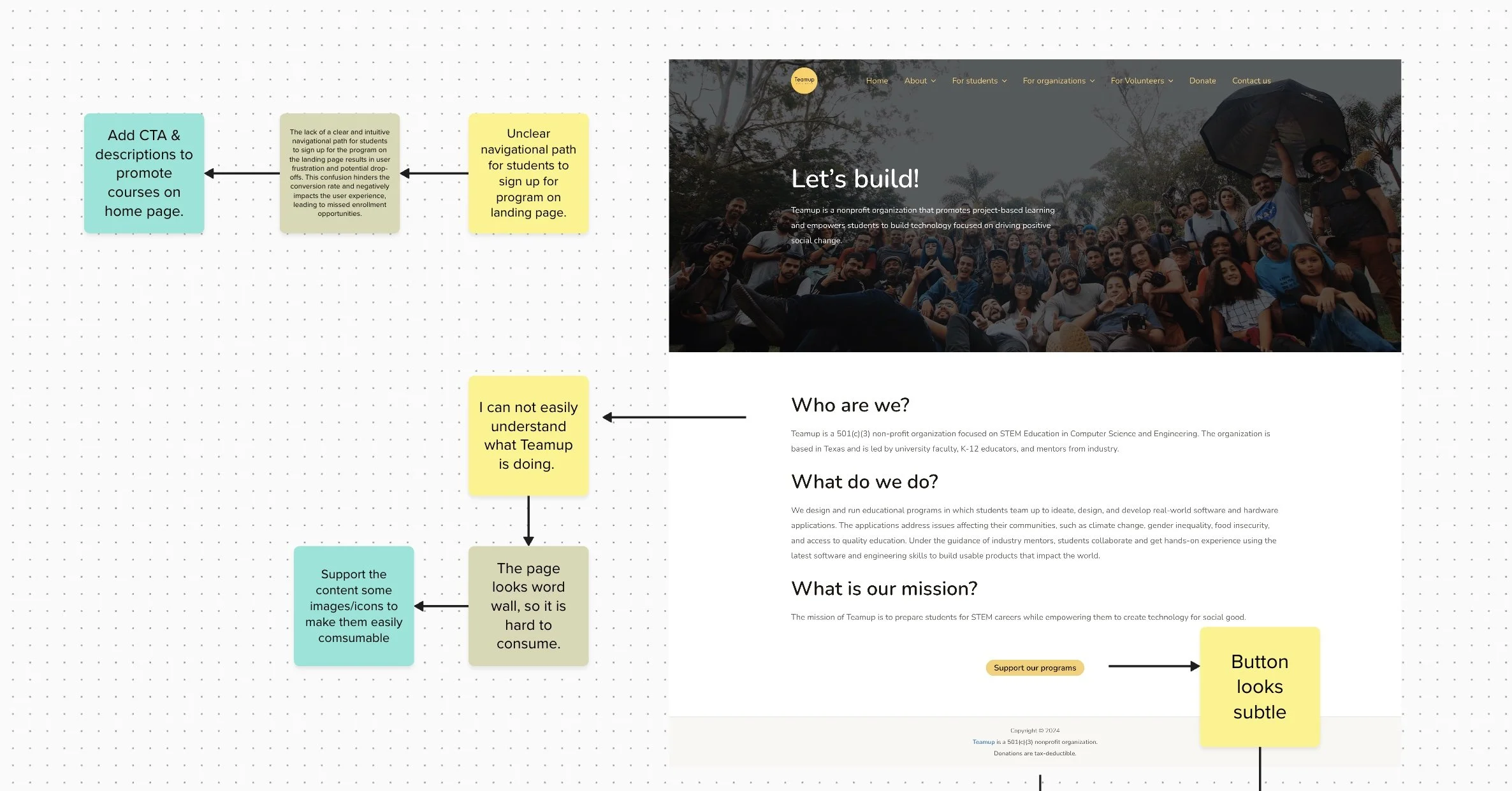
We found the most issues arose from the general user and navigational flow of the site. The information provided on the landing page didn’t invite further action or understanding. Rather, we found that many users ended up more confused about the organization after visiting their website.
Based on these findings, we prioritized our action items for both short-term and long-term projects.
Short-Term: In order to increase enrollment within the next 3 weeks, we focused solely on improving upon the existing internal tools and applications.
Long-Term: Redesign the information architecture and media presence of the organization to increase user engagement over the next few months.
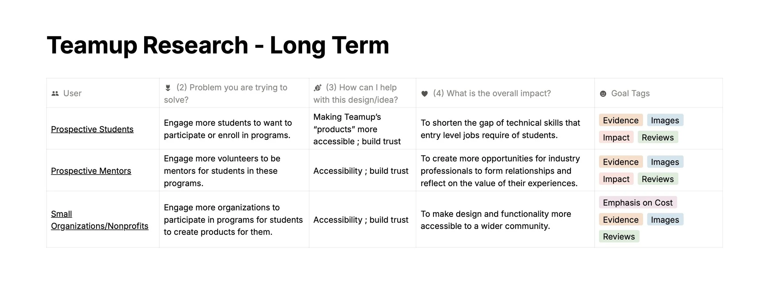
Establishing the nonprofit’s target audience allows designers to research the most efficient flows and information architecture that would benefit each type of site visitor.
How can we engage prospective students, mentors, and small businesses?
3. Ideation & Prototypes
How can I improve upon existing internal tools to increase engagement among a diverse target audience?
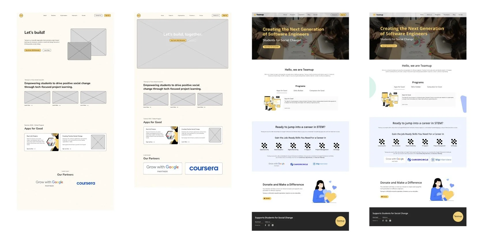
The most efficient course of action was to make adjustments to the current applications that exist on the organization’s website. Instead of creating a completely new design, our team compiled multiple iterations of the current site. Our goal was to create the most impactful changes with “simple” adjustments.
What adjustments will encourage more engagement and comprehension with Teamup’s mission?
We considered various aspects such as typography, logos, navigation bars, action items, information structure, spacing, and visual aides. Ultimately, each iteration was followed by the same question: how does the suggested change add value to the user experience?
This particular change in typography involves designing cohesive typography throughout the site. The current webpage does not accurately represent the tone or goals of the organization. Establishing a uniform system can place stronger emphasis upon the Teamup mission and set up clearer flows for users. With the information presented in a more digestible and attractive manner, we can draw a user’s attention to the proper calls-to-action (CTA).
When considering the navigation bar, we questioned what the main CTA is for visiting the site. How could we adjust navigation to make the first visit impactful?
4. User Testing
Finding a balance between design and marketing feedback.
Throughout the design process, each iteration was tested and reviewed by every volunteer. We asked for feedback on navigational flow and general comprehension. More often than not, discussions over the impact of the typography and visual aides would become the focus of most iterations. It became difficult to decide the value of each version, if the image would convey the message best or the CTA’s beside them.
Ultimately, it came down to how each iteration impacted a user’s experience. User testing showed that users responded more positively to text cues and simpler calls-to-action.
5. Final Design & Short-Term Results
Prioritizing simplicity to meet our short-term goal; creating a more cohesive design system throughout the site.
In order to optimize the user experience within 3 weeks, we defined our top two target users: prospective students and mentors. The most efficient method was to structure the organization’s goals and projects in an accessible layout. We focused on iterating upon the most common flow for the 3 week goal: landing page, project page, and sign up page.
Following with our long-term redesign, we focused on highlighting the organization’s upcoming projects and potential partnerships with other nonprofits.
Student enrollment increased by 200%
Media engagement increased by 20% over the following 3 months


