Healthy Smiles Mobile Dental Foundation

Redesigning a tool for Central Valley communities to access affordable, mobile dental care.

User Research

Interaction Design

Prototyping & Testing

Website Design

June 2023 - Aug 2023

Sep 2024 - Ongoing

Platform

Responsive Website (UNDER CONSTRUCTION)

Project

Timeline

Role

This revised website is currently being updated.

A resource to simplify access to dental care

1.Overview

The Healthy Smiles Mobile Dental Foundation has been an integral part of the Central Valley community for three decades as a non-profit mobile dentistry. Over the past 8 years, the organization has expanded throughout California’s Central Valley to offer children of low-income communities access to free and efficient dental care. 

With its expansion, Healthy Smiles hopes to provide more accessible and affordable dental care to underprivileged communities.

Goal: Identify essential features and usability issues to increase user accessibility and interaction.

2. Research & Empathy

Addressing issues of language accessibility & user flow with the website update

The organization struggled to keep up with calls and inquiries throughout a normal work week.

Interested parties contacted the organization primarily by phone due to a lack of language accessibility on their website. Over 50% of the Central Valley are Spanish-speaking and use Spanish as their primary language.

Most users surveyed expressed interest in finding a more efficient communication system to address the needs of their clients. They found that clients would send voice notes in the form of an email or would give up when their calls were not answered on busier days. In addition, I found that my client wanted the ability to edit their website with ease and efficiency to provide relevant information at all times.

Language Accessibility

User Flow

Website Management

To address the issues mentioned above, I considered the following solutions:

1. Language Accessibility

Create simple action item to change website language to Spanish and verify the accuracy of translations with the help of representatives from Healthy Smiles.


2. Restructure Information Architecture

Adjust organization of information for better user comprehension and navigation.

3. Website Builder

Create a Contact Page that allows any user to send messages directly to the account manager.


4. Contact Page

Use a different website builder to allow for the account manager to edit the website at any time. I will also consider issues with website management when designing the flow of the website. For example, information that would be edited more frequently will be placed on its own page.

My goal was to gain a better understanding of the website’s target audience before I began considering design elements. Based on the previous survey research conducted, I found that the focus should be placed primarily on parents. While the organization provides dental care for children, the Healthy Smiles staff mainly interacts with parents who are seeking treatment for their children.

The intention is to create a user-friendly experience to reflect how Healthy Smiles professionals interact with children to build a sense of trust. I believe this can be achieved by placing heavier focus on pictures of the organization’s school visits and staff, such as the photos shown below.

I conducted surveys to understand why users contact the organization or visit the current site. I found that most clients who would contact the organization or visit the website did so to get more information about school visits. Overall, most potential clients had the following intentions:

Trust

Learn

Schedule

Based on this analysis, my main focus when starting the design process will be on creating a simple user flow and a trustworthy design.

3. Ideation

Prioritizing legibility and simplicity when considering user flows that invoke reliability

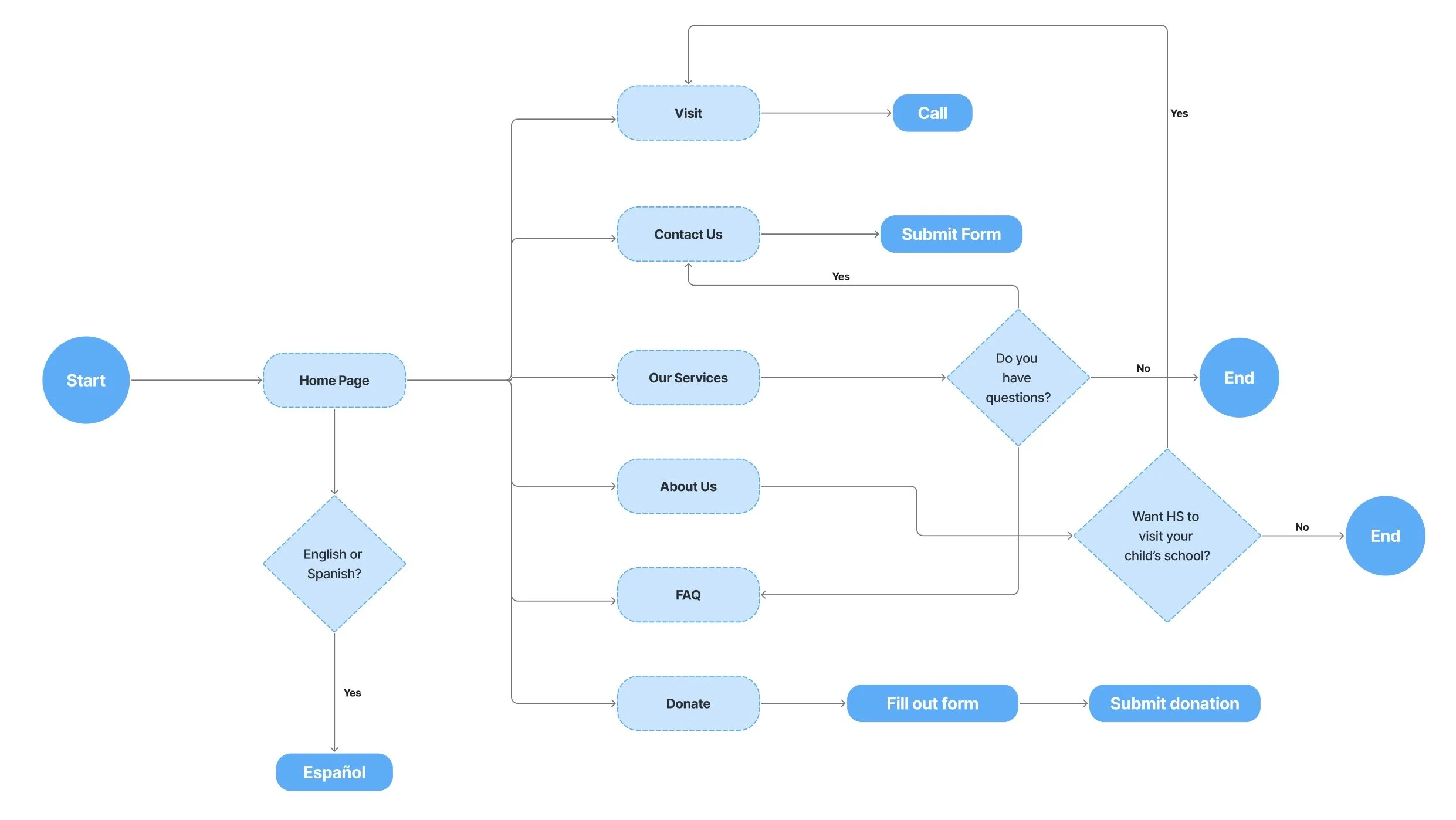
I went through numerous iterations per screen, adjusting image placement, content, titles, typography, and action items. I often played with changing the general shapes, using circles in a few iterations and squares in others. I ultimately came to the layout below to insure a simple and efficient user flow.

I placed heavier focus on noting where to place buttons and action items on different pages, considering the type of user flow each persona may be using.

For example, our first persona of a working mother might simply try to contact the organization directly. If she is at work and hoping to quickly find answers, she would look for the most efficient means of communication. In that case, I placed a contact item in the header of the site for easy access to methods of contact.

My solution was to lean into the theme of dentistry by using the memorable swirl and colors of toothpaste.

When creating the color palette for this site, I wanted to choose a theme that would not only encourage clients to explore but it would also portray a sense of professionalism.

In order to incorporate these components into the design, I reconsidered the initial layout to focus more on typography and spacing. I wanted to ensure the amount of information wasn’t visually overwhelming, while creating a design that supported a smooth flow of information.

While I wanted to adhere to a more professional take and avoid a comical look with overly large text, I also wanted the website to be legible in any context.

When considering the user personas and their particular locations in using the website, I concluded that target users could likely be on the move, accessing a mobile website or smaller screen (such as a tablet). To accommodate for this, I ensured the font was bold and legible within a condensed screen.

4. User Testing

Simplifying user flows and prioritizing action items through user testing

Before finalizing the website design, I opted to test the website on another 5 volunteers from Healthy Smiles. I presented them with the website to gain first impressions as well as feedback on navigational prompts.

“I love that it looks like toothpaste! I do think the Spanish translations could use some work though.”

“I like that you added a Spanish translation for the site. Parents always call instead of using the website because they don’t speak English.”

“Honestly, it’s kind of a lot to look at.”

“Really easy to navigate through, I don’t really have any complaints other than the buttons.”

Regarding the first comment, they were referencing the response time of the buttons in certain pages of the website. In particular, the contact page contains ‘confirm’ and ‘cancel’ buttons that use an additional confirmation action item. Considering other similar comments, I opted to remove that additional confirmation where it’s unnecessary.

Based on previous research, most users contacted Healthy Smiles due to language inaccessibility or lack of time. In the final design, I opted to simplify the most common user flows and prioritize the most useful action items.

5. Final Design (Part 2)

Retouching the toothpaste inspiration; finding balance between whimsical and minimal

In considering the results and comments from user testing over the following months, I made several adjustments to the the informational architecture, action items, and typography structure. Below is the final result.

6. Reflections

Implementing AI chatbot to increase general accessibility and response efficiency

Following this website redesign, my next goal would be to incorporate an AI chatbot within the website. This chatbot can be personalized based on the most common questions asked whenever customers call Healthy Smiles. Ideally, this could reduce incoming calls and increase overall efficiency during a working day.

I believe a difficult challenge in this goal would be wanting to humanize the experience a user might have with a chatbot. In many cases, users reaching out are parents seeking help or information to receive dental care for their children.

Next Case Study: